Clara, Josephine, Fractur*a, Futur*a
12 November 2021 • Uliana Bychenkova
Not only the future is female but the past is also female
THIS IS A SAMPLE HEADING STYLE 1
History is not a fact but only a story, a narrative that is not neutrally embodied. Thus, not only new can be female but old can also become a new—and female—narrative. I combined my interest in the origins of book design with the framework suggested by the residency’s theme—reactualisation of female movement history in Leipzig—and I imagined a bibliographic alternative, which is a gesture that symbolically compensates for under-representation and an exercise in book cover historical styling.
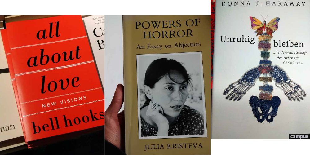
Important to me, Luce Irigaray’s ideas about feminine morpho-logic [1] in creative work are usually interpreted in the context of language (écriture féminine), while artistic research touches upon the area of visuality. Design and applied arts matter to me as a feminist artist in how they are connected to everyday life: they shape it and act as agents of my own routine. In the history of design, we not only deal with a non-neutral tone of narratives but we also deal with real artefacts: can we argue with them? Artefacts document the conditions in which they were created, or constraints in those conditions—and such a deficiency is able to heat up political issues and fuel the passionate construction [2] of feminist artistic research.
In commodo lectus imperdiet, convallis est ut, efficitur nisi. Nulla scelerisque sollicitudin aliquam. Vestibulum rutrum lacus et convallis molestie. Nam dictum erat purus. Duis consequat elementum congue. Cras metus tellus, rutrum eget lorem a, posuere tristique nunc. Donec tincidunt ante at ligula aliquet blandit. Ut volutpat mi et ex tristique, a porttitor ante fringilla. Quisque feugiat turpis nec lorem mollis dictum. Integer vulputate libero quis neque pharetra, pretium viverra ex euismod.
The City of Women in Women’s House, in Women’s Room, in Leipzig
From the starting point of travelling to Leipzig, I was curious about feminist graphic designers as the modern context which I only could fantasize about. Also, I was rather anxious about the celebrated book tradition which I fetishized more than imagined in reality. At the intersection of book and gender history, I found two insanely interesting spaces here that are located in the past: Women’s Pavilion (Haus der Frau, literally translated as Women’s House) and Women’s Room (Frauenzimmer).
In commodo lectus imperdiet, convallis est ut, efficitur nisi. Nulla scelerisque sollicitudin aliquam. Vestibulum rutrum lacus et convallis molestie. Nam dictum erat purus. Duis consequat elementum congue. Cras metus tellus, rutrum eget lorem a, posuere tristique nunc. Donec tincidunt ante at ligula aliquet blandit. Ut volutpat mi et ex tristique, a porttitor ante fringilla. Quisque feugiat turpis nec lorem mollis dictum. Integer vulputate libero quis neque pharetra, pretium viverra ex euismod.
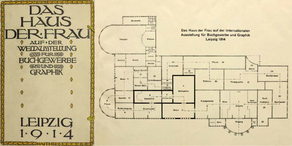
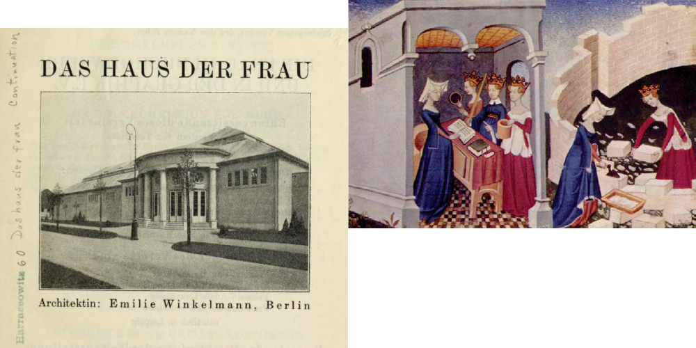
Before World War One, Leipzig’s book industry employed around 10% of citizens and the number of publishers was getting close to 1,000. In May 1914, the first international book fair was held in Leipzig, gathering participants from over 30 countries. For this event, Berlin-based independent architect Emilie Winkelmann built the Women’s House as part of the project called Women in Book Trade and Graphic Art. This project, created under the patronage of the princess and artist Mathilde of Saxony, showed the accomplishments of women in new female book professions: photographers, illustrators, type designers, layout designers, and writers. To me, it seems like a tremendous precedent even from today’s perspective. The Academy of Fine Arts Leipzig was the first German institution to allow women to study (starting from 1905). Only 9 years had passed from that moment to the book fair. In a detailed catalogue, we can see 19 female type artists, 13 of whom were from Germany and 5 were based in Leipzig. It’s not easy to find their work now but the book fair documentation speaks for itself.
Thinking of how utopian that looks from today’s perspective, I remembered another literary and visual monument, The Book of the City of Ladies (Le Livre de la Cité des Dames), written in 1405 by Christine de Pizan, known as the first professional female writer in history. In the book, there’s a metaphorical city for women that is being built under the supervision of three allegorical female figures: Reason, Rectitude, and Justice.
In commodo lectus imperdiet, convallis est ut, efficitur nisi. Nulla scelerisque sollicitudin aliquam. Vestibulum rutrum lacus et convallis molestie. Nam dictum erat purus. Duis consequat elementum congue. Cras metus tellus, rutrum eget lorem a, posuere tristique nunc. Donec tincidunt ante at ligula aliquet blandit. Ut volutpat mi et ex tristique, a porttitor ante fringilla. Quisque feugiat turpis nec lorem mollis dictum. Integer vulputate libero quis neque pharetra, pretium viverra ex euismod.
When looking at this building, American projects of the 1970s come to mind—Womanhouse and Women’s Building that paved the way for institutionalising feminist artistic practices. These projects also dealt with applied arts, feminist graphic design, and alternative education.
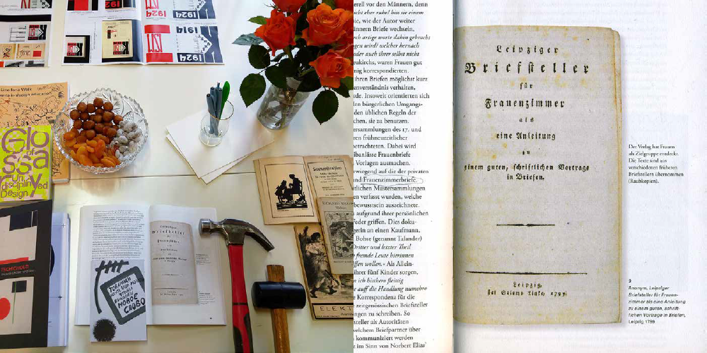
Book cover. Leipziger Briefsteller für Frauenzimmer als eine Anleitung zu eine guten, schriftlichen Vortrage in Briefen. 1799. Source: Die Sammulung Krein, Bestseller — Briefsteller, Guttenberg-Museum, 2021
Before World War Two, there was a whole graphic quarter in Leipzig—Grafisches Viertel. It was actively involved in publishing but then was almost fully destroyed. After the war and the division of Germany, a lot of printing enterprises moved to the West where there was another book fair capital, Frankfurt am Main, while Leipzig remained the major book city in the GDR.
When I travelled to the international book fair in Frankfurt, that also happened this October, I came across the Gutenberg Museum’s booth and encrountered a book about the culture of letter writing, Bestseller — Briefsteller. This publication included a cover of the book published in Leipzig in 1799, Leipziger Briefsteller für Frauenzimmer als eine Anleitung zu eine guten, schriftlichen Vortrage in Briefen—it’s a guidebook on how to write letters to effectively present yourself addressed to either women or women’s room. The fact that the words “woman” and “women’s room” are practically synonyms in German confused and intrigued me. Literally, “Frauenzimmer” combines the words “women’s” and “room”: following Virginia Woolf’s thought expressed in her pioneering essay A Room of One’s Own, these are two concepts important to feminist theory and politics. Reflecting on this word, I found it more related to the concept of Unheimlichkeit introduced by Sigmund Freud because it represents various tones of feminine chaos and horror: recklessness, abstrusity, woman’s purse mess, womb, closet, and frantic collective female practises. Emerged to label domestic spaces, over time the word “Frauenzimmer” got transformed into a generic term and later gained specific misogynistic implications. Given that in modern German, this word is considered outdated and is used quite rarely, it accumulated some contradictory conjectures, which inspired me to reappropriate it by using it as a collaborative worskshop’s title. Leipziger Frauenzimmer is a modest gesture in the memory of the intimidating Das Haus der Frau. The text on the workshop’s poster—just like the one on the cover it refers to—is typed in the typeface Fraktur, who is a figure with a fate no less notorious than this word. So we have to revisit her past.
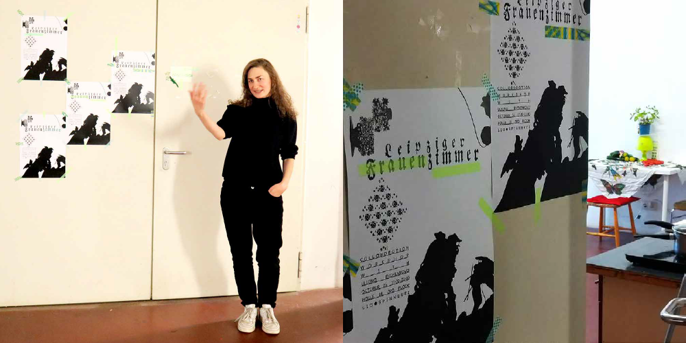
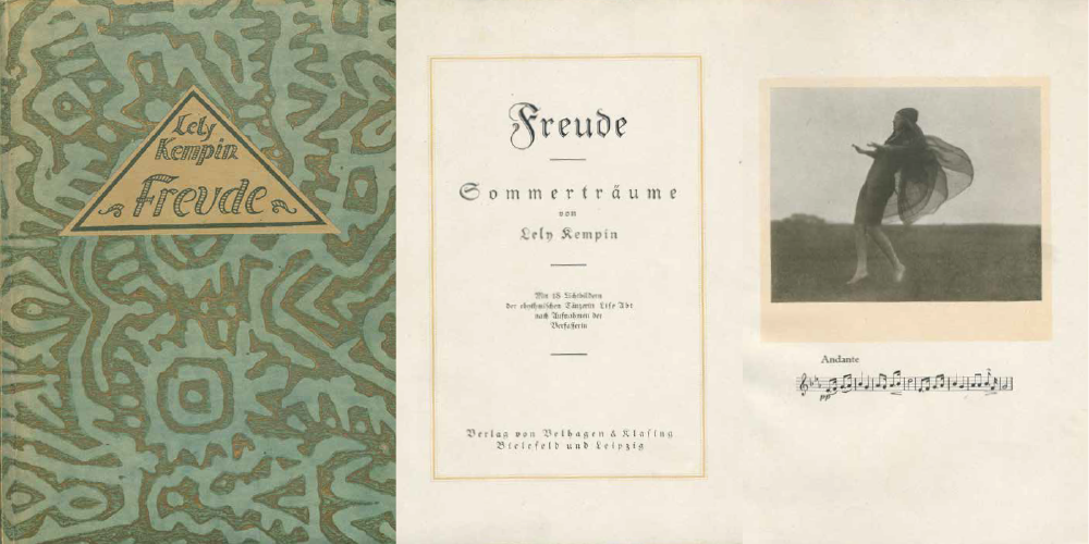
Uliana Bychenkova, posters of the collaborative workshop Leipziger Frauenzimmer. Photo: Saki Hoshino, Uliana Bychenkova
From the feminist perspective, a collaborative workshop is self-education together. But conducting a workshop for students of one of the oldest and most star-studded book art schools—Academy of Fine Arts Leipzig (Die Hochschule für Grafik und Buchkunst, HGB)—where Jan Tschichold was studying and teaching and Albert Kapr was a rector, looked like a pretty daring idea or even an intervention, which I chose to perform on my own territory. I invited students to my studio by using an internal student email list. I prepared information on women connected to important political issues of the city and collected copies of old publications for inspiration and imitation of a specific style.
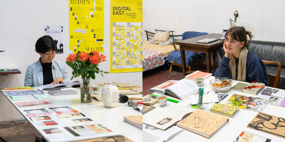
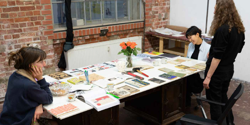
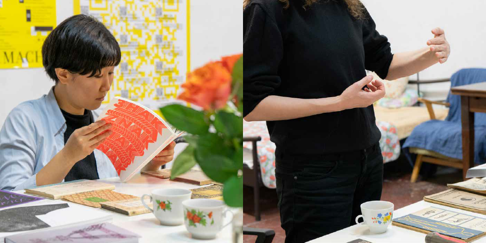
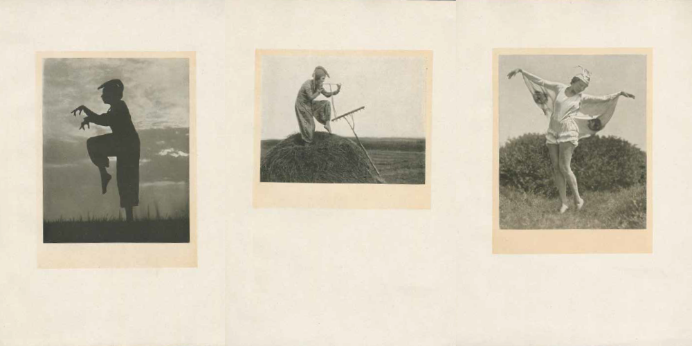
Uliana Bychenkova, Eunjung Hwang, Yola Brormann. Collaborative workshop with HGB students in the artist’s studio at the Spinnerei residency. Photo: Ramona Schacht
The challenge of creating an alternative bibliography lies not only in learning the details of female history and history of graphic design (people and events, compositional structures and typography) but also in experiencing these histories formally and meaningfully, finding connections inside them and inspiration for solidarity so that you can suggest fictional paths of an alternative graphic art space. Naturally, this is not the only challenge in feminist artistic reconstruction: political tribulations of German typography create lots of ambiguities.
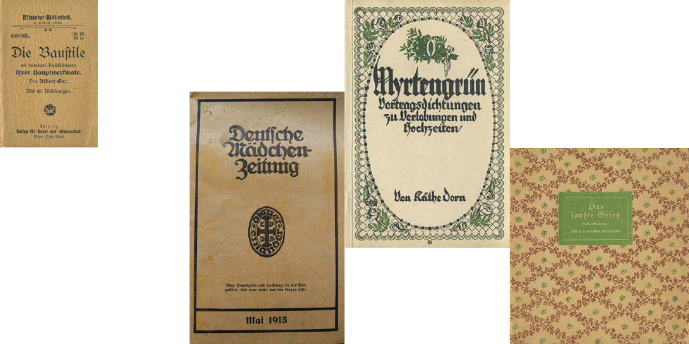
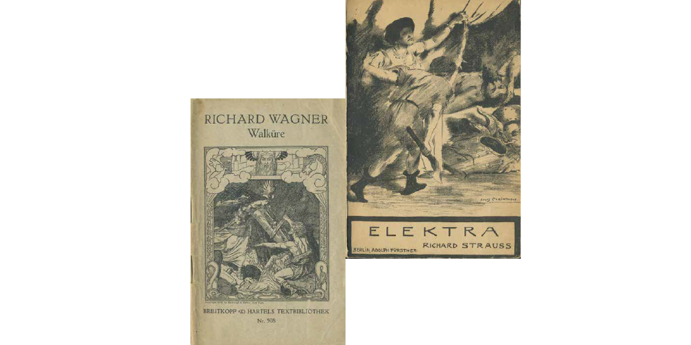
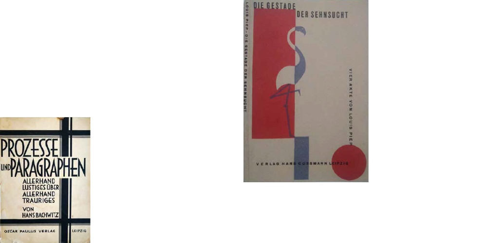
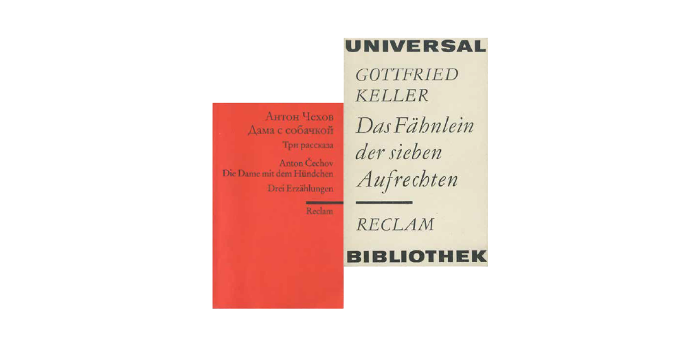
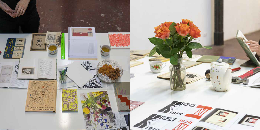
Samples of old German publications (1900–1990)
The book cover design is usually based on compositional principles inherent to a given time and location, on fonts that are relevant to a given context, and sometimes on images or decorative elements. But the most responsible task is always associated with fonts. There’s a belief that font designers can hardly sit through a historical film because of incongruity. However, I’m more intrigued by other, possible style paths, which is a valid research area in typography: it means considering the suspended lines of form development not as dead-end paths but as authentic aesthetic treasures that can be cultivated in today’s life.
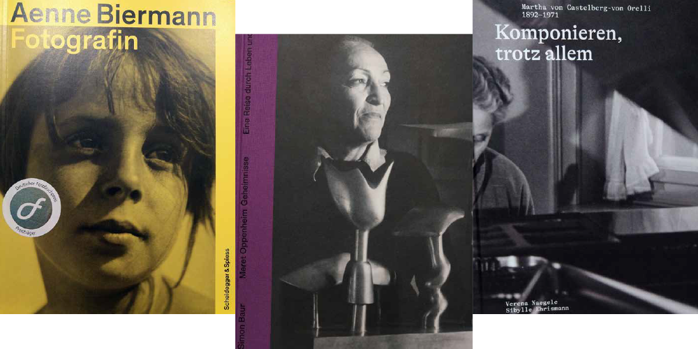
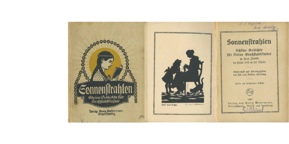
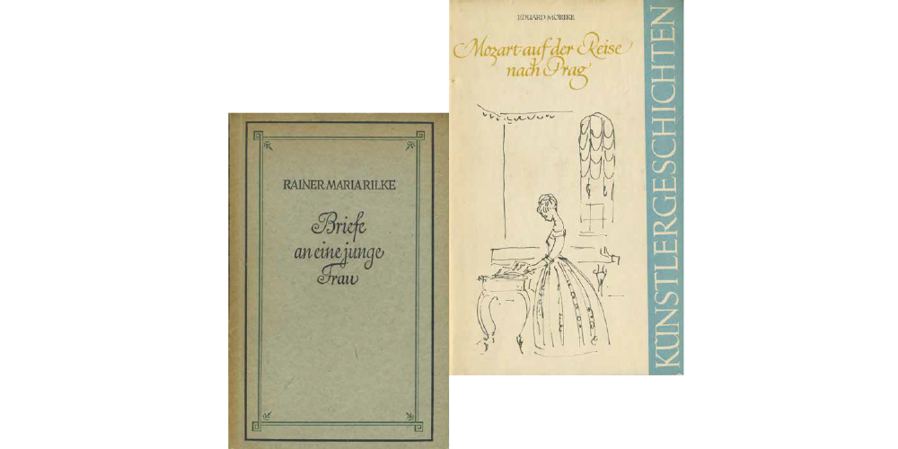
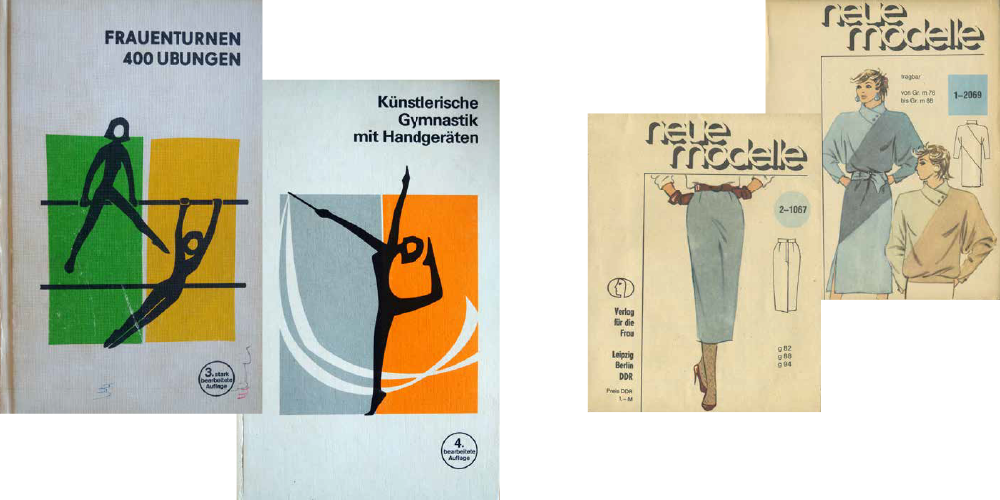
Samples of modern feminist non-fiction publications, women's biographical and fictional literature
From a fracture to a curve, and back, and back
Aesthetics has many times become a stumbling point in the history of German typography, revealing contradictory but undeniable precedents that show the potential of the form. The first printed book in Europe was typed in 1454 using a variation of the German gothic typeface Textura, which means “fabric.” The later, more ornate, professional version of this typeface was developed by the 16th century: it was called Fractura, which can be translated as “fracture.” As an apologist of German literature and a reformer, Martin Luther believed that separating from the Catholic church would be more effective with the reformation of writing and its effect on publications and calligraphy practises. Opposed to the curly nature of Italian form, the German gothic writing style was thus seen as “an island of broken script in a sea of curves.” [3]
It sounds like typography is comparable to tone quality and all that is similar to language wars. For example, Otto von Bismarck claimed that he wouldn’t read a German book typed in a “non-German” typeface, by which he clearly meant the Roman Antiqua. Roman typefaces were settled in the foreign literature niche that was rapidly gaining more importance. The quarrel called the “Antiqua-Fraktur dispute” went on for a long time at the turn of the 20th century, shifting the blanket’s texture towards one side or another, annoying scholars, publishers, and all the others. It was happening up until January 1941, shortly before World War Two, when the issue was finally resolved to the benefit of Antiqua: an official decree forbad using Fractura which was claimed to represent “Jewish letters” that, according to Nazis, contradicted the “German idea.” At the same time, Jews themselves were not allowed to use Fractura since 1937, when the typeface was defined as the embodied heritage of Germanness.
According to a typeface historian, founder of the Book Institute, teacher, and rector at Die Hochschule für Grafik und Buchkunst Albert Kapr, who put a lot of effort into exploring the background behind Fractura exclusion, this decision was defined by pragmatic reasons needed for establishing communication on occupied territories [4]. Unlike Bismarck, Hitler was worried that the universal nature of the Roman typeface would come in handy for the Third Reich if German became an ultimate European language in a hundred years.
However, typefaces based on the German gothic form were utilized for agitational purposes during the first years of Nazi reign, and covers of the two-volume Mein Kampf (1925–26) were designed with Fractura, establishing its aesthetical connection to Fascism. Despite that, Hitler wasn’t known as a Fractura advocate—on the contrary, he found it to be hopelessly provincial and old-fashioned for the era of progress and, as he said in the Reichstag in 1934 [5], not suitable even for expressing “female beauty and male strength.”
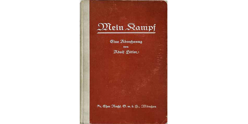
Cover of the first edition of Mein Kampf, 1925
At the end of the day, who is this hegemonic Roman figure who replaced Fraktur? Is it Antiqua, which means “a serifed typeface” now, or just the Latin script? If Antiqua is translated as “ancient,” does that mean it’s Greek? Speaking of character construction, all of these are a single heroine, but the Roman typography had been making headway at the turn of the century, losing serifs or transitioning to a new typeface form, grotesque.
But is it a question of how fast it progressed? Monumental writings with no serifs were present in ancient times and even preceded serifed scripts. The Doric and the succeeding Ionic order in Ancient Greek architecture differ in having pilasters in column construction and serifed letters, which possibly makes serifs a question of an aesthetic choice within an ensemble of the form.
Grotesques have been used in the typesetting to highlight parts of newspaper announcements or advertising boards since the end of the 19th century: they caught people’s attention by their unusual look. However, they didn’t represent a novel typography but rather a fairly ancient one, Doric [6] (the first English grotesques were considered to belong to this typeface group). At the same time, it’s clear that compact lettering was by its spirit much closer to a new architecture, which also contributed to the growing popularity of grotesques.
In fact, sans-serifs (which means “without serifs”) imply not only the lack of serifs but also alternative means of form-making. The universalist idea of a graphic Esperanto that was aspired in the 1920s, seen as a salutary opposition to all types of national ornamental elements, was replaced by Geometry, a new practical and allegorical figure. The time was ripe for neither written nor drawn but designed construction based on graphic primitives.
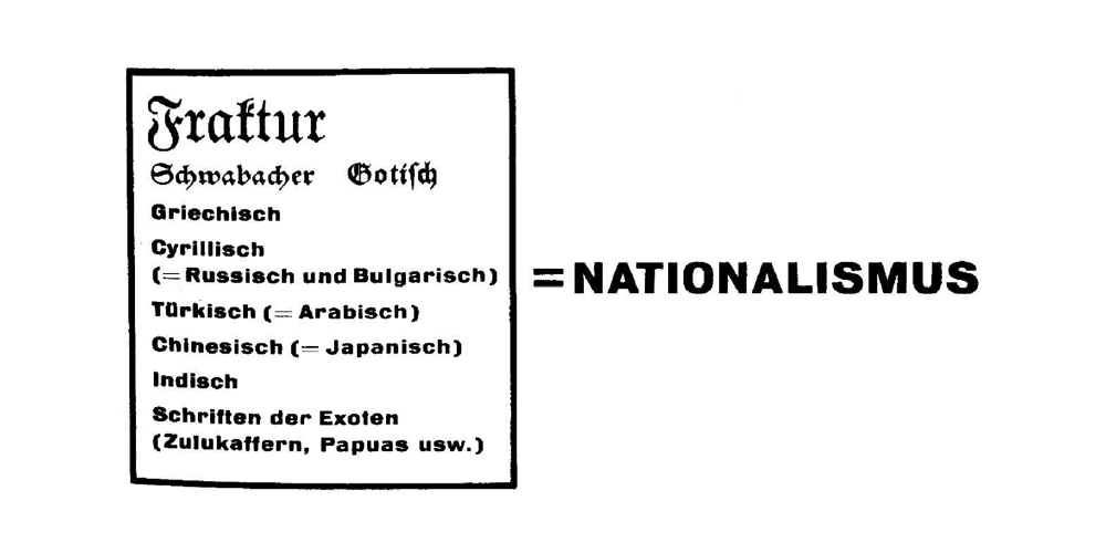
Table from the edition New Typography by Jan Tschichold, 1928
After graduating from the Leipzig Academy of Graphic Arts and Book Production, Jan Tschichold visited the first Bauhaus exhibition in Weimar in 1923 and became interested in modernist aesthetics. In four years, he opened his own exhibition called New Typography, and one year later, in 1928, he published the same-name manifesto, encouraging to use grotesques exclusively and back away from symmetrical composition adopting asymmetrical alignment instead. He was also accusing all historical national writing systems of nationalism (including both the Cyrillic script and Fraktur). At the same time, he complained about the imperfections of grotesques that were in use, claiming that they should be significantly further developed. He also made a complimentary reference to Paul Renner’s typeface Futura as a “significant step forward.” [7]
A well-known geometric grotesque called Futura (which means “future”) was presented to the public in 1927 by Paul Renner, the same year Jan Tschichold’s exhibition took place. The following lives of two designers had been in sync in major milestones and circumstances: both Renner and Tschichold worked at the printing school in Munich and emigrated to Switzerland in 1933, after being arrested on accusations of cultural Bolshevism.
But in 1931, a few years after publishing his radical ode to grotesques, Tschichold started using serifed typefaces again, and later on, he passed the same strictures on his avant-garde statements, finding plastic principles of modernist typography to be militarist and fascist, and claiming his own judgment on national scripts to be Europe-centric. At the time New Typography was published, its legendary author was only 26 years old, but the book is still getting published and translated as a globally influential practical guide and historical document that had radically shifted the classical graphic design paradigm into the modernist one.
Clara, Josephine, Fraktur*a, Futur*a
Getting back to human heroines, I was marveled by one insignificant coincidence. Two famous Leipzig-born women who made their names in politics and music share the same first and middle names: Clara Josephine Zetkin and Clara Josephine Schumann. By marking their surnames with the capital letter, I had the courage to put their names in a single conceptual and graphic space for a dialogue we can only imagine.
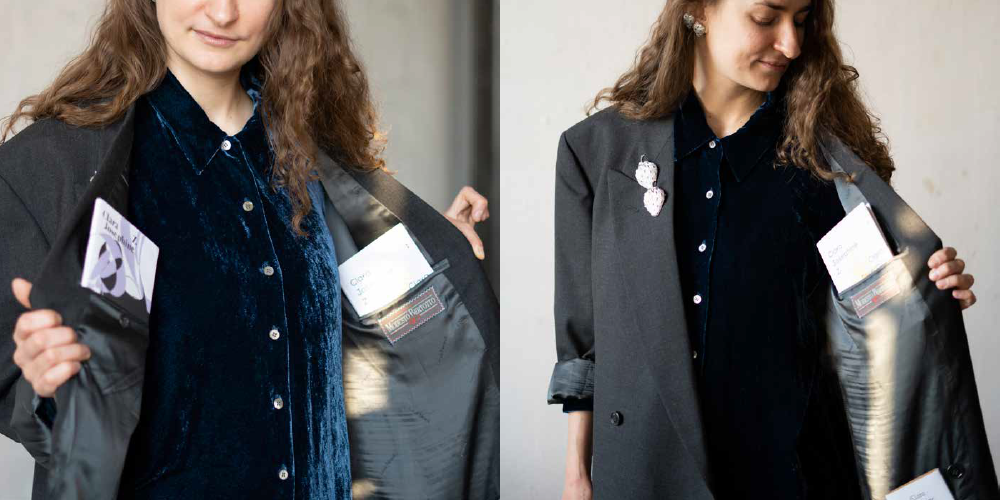
Uliana Bychenkova wearing a jacket with replicated books hidden in it. Leipzig, 2021. Photo by Ramona Schacht
The story follows three aesthetic and temporal eras represented by classical, modernist, and postmodernist imitation exercises—books which I carried to the Leipzig University Library (Bibliotheca Albertina) in stash pockets of a man’s jacket.
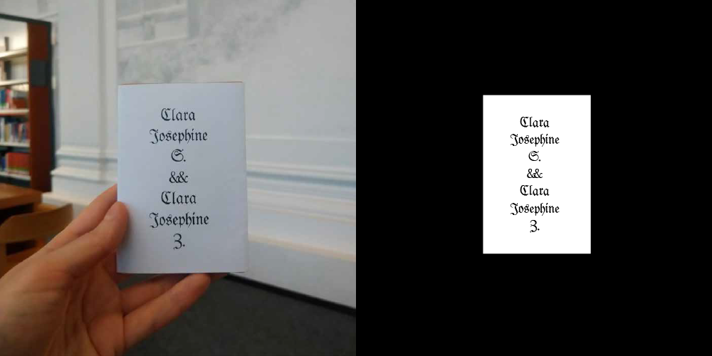
Exercise 1
I slightly amended an austere composition based on central-axial symmetry by doubling ampersands to accentuate the dialogue. The Leipziger Fraktur typeface used here is a digital creation by Peter Wiegel which is based on the research of over a hundred book copies published in Leipzig before the 1941 reform.
Exercise 2
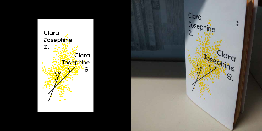
Mimosa was a symbol of international women’s day in the USSR, which also was supposedly dedicated to Clara Zetkin’s birthday. I like this flower, but up until now, I haven’t thought if there’s any connection between its shape and the symbolism of a soviet holiday. Was this flower with little bulbs that doesn’t have a typical calyx-shaped structure purposefully chosen to be a socialist flower of the new femininity? Was international female solidarity seen as a cloud constellation of yellow grains? I decided to apply the geometric expressiveness to a notionally modernist cover sketch by combining a mimosa with the Five Years Later typeface developed at the Typefaces of the Temporary State and based on the first Futura sketches, rejected by its creator. Amusing geometric vagaries were eventually smoothed out, but it’s interesting to explore the transitional stages of form development.
Exercise 3
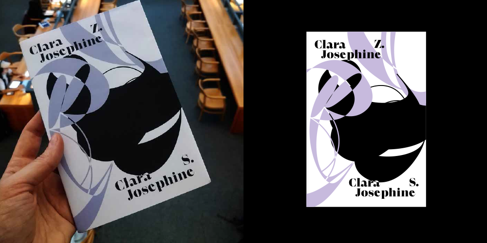
The postmodern paradigm in graphic design is, amazingly enough, historically connected to real female names. At the end of the 20th century, women had been becoming designers increasingly more confidently and massively. What’s especially important, they were getting established in the profession and taking their places in the public history of formal developments. A digital typography pioneer Zuzana Licko, the “Queen of New Wave” April Greiman, the first female partner at the prestigious Pentagram studio Paula Scher, and other American female designers brought new deviations from the old rules of “new typography” in the 1980–90s. Digital practices allowed not only for ultra-efficient structuring but also for the new expression whose major feature was a totally filled surface. The book space of reading and imagery makes another bold leap into the space of virtuality—agile, raw, and layered.
The third exercise’s heroine is Lenora, the modern-day Antiqua inventively and with interest to historical forms developed by Superior Type. The abundance of typographic curves mixes up the entire cover. I chose her when searching for expressive ampersands and because of developing an accidental personal sympathy while working with her.
Bibliography
[1] Luce Irigaray, Je, Tu, Nous: Toward a Culture of Difference, trans. Alison Martin, (New York: Routledge, 1993), p. 59
[2] Donna Haraway, “Situated Knowledges: The Science Question in Feminism and the Privilege of Partial Perspective”, Feminist Studies, Vol. 14, No. 3 (Maryland, College Park: Feminist Studies, Inc., Autumn, 1988), p. 585
[3] 99 percent invisible, episode №390 “Fraktur”, (February 18, 2020) https://99percentinvisible.org/episode/fraktur/
[4] Albert Kapr, Fraktur: Form und Geschichte der gebrochenen Schriften (Mainz: H. Schmidt, 1993), p. 81.
[5] Völkischer Beobachter Issue 250, (September 7, 1934).
[6] Денис Машаров, лекция «Эволюция гротесков», (Санкт-Петербург, Школа шрифтового дизайна, 2016), видео, 4:50, https://youtu.be/6ljfKwlf2EA
[7] Ян Чихольд, Новая типографика. Руководство для современного дизайнера, пер. с нем. Л. Якубсона (Москва: Изд-во Студии Артемия Лебедева, 2011), стр. 76.
I want to thank many people for communication and support: Maryna Vinnik, Asia Bazdyrieva, Ramona Schacht, Katharina Köhler, Olga Vostretsova, Kristina Semionova, Kati Liebert, Saki Hoshino, Ivan Melnychuk, Anna Grinkevych, Lada Nakonechna, Yevgenia Belorusets, Anna-Louise Rolland, Eunjung Hwang, Yola Brormann, Susanne Strätling, Carolin Krahl, Melina Weissenborn.
I would also like to mention some sources as a bibliography list, not quoted but used as objects of inspiration, “fellow things”:
Image 14. List of publications: Varvara Stepanova, “Genossen, bringt Eure Hämmer, um das neue Wort zu schmieden,” Tusche auf Papier, 1919. Abb. 82 aus: Susanne Strätling: Die Hand am Werk. Poetik der Poiesis in der russisen Avantgarde. München 2017, S. 293; Die Sammulung Krein “Bestseller — Briefsteller,” Guttenberg-Museum, 2021; Stephanie Jacobs, Patrick Rössler “Jan Tschichold — ein Jahrhunderttypograf? Blicke in den Nachlass,” Deutsches Buch- und Schriftmuseum der Deutschen Nationalbibliothek, Leipzig, 2019; Manon Bruet, Julia Andréone, “A studio visit: Ines Cox,” Revue Faire №18, Paris, 2019; Karel Martens “Tokyo Papers,” Roma Publications, Amsterdam, 2020; Nina Paim, Corinne Gisel, Emilia Bergmark, “Taking a Line for a Walk,” Spector Books, Leipzig, 2016; Anja Kaiser, Rebecca Stephany “Glossary of Undisciplined Design,” Spector Books, Leipzig, 2021.
—
This publication is produced within the residency exchange framework of the Dreams for Sisterhood project initiated by Method Fund. The project is implemented in partnership with Open Place (Kyiv), the city of Leipzig, Bureau for Cultural Translations (Leipzig), Institute of Political Narratives (Leipzig), Leipzig International Art Programme, and Kyiv Biennial. The project is supported by the Ukrainian Cultural Foundation, the Memory, Responsibility, and Future Foundation (Berlin) — within the Culture for Change programme, Goethe-Institut Ukraine, the state administration of Saxony and Leipzig. It’s dated to the 60th anniversary of sister city arrangements between Kyiv and Leipzig.
–
Uliana Bychenkova is an artist, curator, designer, and researcher. Focusing on practical issues in her art, she takes a point of view of feminist revision to specify and reassign dispositions of power in urban spaces, discrepancies of the symbolic power in professional fields, or the status of decorative and applied arts. She uses feminist art research, strategic imagination, and tactical inventions shaped with the help of different medium including self-publishing, sound performance, ceramic objects, conceptual terms, etc. Uliana is involved with numerous artistic groups and co-organises a reading group for female artists and theoreticians. She lives and works in Kyiv.
–